
Monday, 30 November 2015
Blueprint Film Visit
We were lucky enough to have another visit from someone from Blueprint Film in Lincoln. Having Dave from Blueprint come visit us proved to be very beneficial; showing someone who had never seen our music video before but has experience with film, allowed us to receive a fresh opinion and any criticism that we could use to our advantage. Even though Dave didn't give us any major criticisms that he thought was crucial we should change, he helped us with a few minor things that helped to make our music video more professional and effective, this was changes such as cutting on the beat with a couple of shots and changing the length of our longer shots.


Monday, 23 November 2015
Use of colour in our music video
In our music video there are only two shots that we have used in colour. The reason we did this was to show the thoughts of Ethan and how much Charmaine means to him; it shows that she's in his thoughts. We thought that shots of Charmaine in colour could symbolise that she 'brightens up' Ethan's world, as well as making it more easier for the audience to understand the relationship between them. We also thought that using using these shots overlapping other shots, made it look a lot more effective and professional as it may of looked like a mistake if it cut straight into a shot in colour.


Friday, 20 November 2015
Magazine advert: Draft 1

This is our first draft for our magazine advertisement. Even though our music video is black and white we have decided to go with the idea of keeping the advertisement in colour; we think that it will be a lot more eye catching and we can use the green as synergy for our CD.
Group post- Digipak: Draft 1
These are our first drafts of our Digipak. We are going with the idea of having all of it in black and white, except the back cover where there is a shot of them both together. We thought this would shots the contrast and maybe make the narrative of our video clear to the audience that he is madly in love with her. I think the shot shows that anyway, but emphasises it more by having it in colour.


These are our first drafts of our Digipak. We are going with the idea of having all of it in black and white except the back cover where there is a shot of them both together. We thought this would show the contrast and maybe make the narrative of our video clear to the audience that he is madly in love with her.I think the shot shows that anyway but emphasises it more by having it in colour.
Tuesday, 17 November 2015
Problems during editing
Whilst editing our music video we found that there were a couple of occasions during our chosen song, that has up to 15 seconds of instrumental. This is something we had to fix as we didn't have enough shots of both Charmaine and Ethan together that could fill these gaps; in conclusion to this, we had to arrange another day of filming, where could collect a number of shots of Charmaine and Ethan together in various locations. This wasn't a major problem as we already had a couple of shots that we needed to re-film, but it is something that we maybe could of organised earlier on, as it could of speeded up the time we spent putting all our shots together.
Group post- Planning: Final shots, Story boards


Friday, 13 November 2015
Group post- Planning: Storyboard for final shots

Further Research- What we found out from The 1975 concert
On the 12th of November 2015, myself and Charlotte were fortunate enough to go and visit The 1975 in concert. Above is a video of them performing their song 'Settle down', which is our chosen song for our music video. Watching it performed live gave us different ideas of the colours to use within our music video (synergy), as we have been quite indecisive about whether to keep the colour in our video or to use black & white. During this performance, the main colours that were used were green, pink and blue. Green is a colour that is very dominant colour in our music video, so the use of colour in this performance has made us more confident in keeping the colour in our video.
Something else that we took from watching this live is the body language of the lead singer (Matthew Healy). It gave us more on an insight into how to instruct our star image to act on camera during performance shots, so it works well and suits the song.
The 1975 have just come back from a year break; before this break numerous of their music videos were edited black and white, and previous occasions I have seen them perform live, their stage design was black and white as well. However during this concert there was no black and white, and instead various different colours were used, this could be to signify they're returning with a new image. This could link to the idea that we found in our target audience research; at the beginning of our music video it could be black and white, and as the relationship in the video starts to blossom, we could revert to colour.
Tuesday, 10 November 2015
What have we changed?
Whilst out filming we found that using are shot lists made our organisation and time efficiency a lot better. However there were some occasions whilst filming, that we came up with a better idea than what we had originally thought, or tried out different shots that we hadn't already tried. For example, when filming some performance shots with Ethan, we decided to try some high angle and low angle shots, which is something he hadn't put in our shot lists; we actually found that these shots looked and worked a lot better, as well as giving us a wider range of shots. Something else that we changed whilst filming was some locations. We thought that we wanted a wider range of locations throughout our video, so we found some more locations where we were able to film shots of Ethan and Charmaine together, and also some performance shots of Ethan.
Group post- Planning: Final shots
While editing we saw we needed just a few more shots of both Ethan and Charmaine together. As they both go to different colleges and it's quite difficult to organise a film shoot when they both have free periods, we created this simple written shot list so we knew exactly what we needed to finalise our video.


Monday, 9 November 2015


Further Research: Target Audience Research
Here is a voice recording of our feedback from a small focus group, after showing them the first minute of our music video. We wanted to know what they thought of using black and white for the music video, or whether it would look better with colour. As well as this we wanted to know their general thoughts and whether they had any ideas that we could use to improve.


Problems whilst filming
Whilst filming our video we found that when looking back at the footage, there numerous shots that were cut short. This was a problem that we were unsure about why it was happening, however it was something that we had to fix. With the shots being cut short this meant that the singing and acting was cut short as well, resulting in us being unable to use the footage. After rescheduling to re-shoot the footage, we continued to film for up an extra 15 seconds so there was no chance that the footage would be cut short.
In our music video we decided that we were going to use natural lighting throughout the whole of our music video, however this could often cause a problem with being able to focus on the actors with the sunlight being so bright. We fixed this by locating the camera in a better or convenient place and chose various angles to avoid the brightness.
There were some days where we had organised to film, but down to the whether we were unable to do this, resulting in having to rearrange. Filming in the rain would of made things very difficult, as well as it being a major distraction.
There were some days where we had organised to film, but down to the whether we were unable to do this, resulting in having to rearrange. Filming in the rain would of made things very difficult, as well as it being a major distraction.
Friday, 6 November 2015
Planning: Star Name
We have chosen to use 'Ethan B' for our star name for Ethan. We thought that this name is short, eye catching and suitable for our genre of song. Shortening 'Brown' to 'B' we thought would give the name a unique edge, and give something different to the star image. We have quite a few photos of Ethan that we are considering using for our digipak and magazine advert, and we feel as though these images along with some images of both Charmaine and Ethan together would work really well.

Further Research: Extreme close-up shots
Whilst watching this music video by Adele performing 'Hello', I found that there were a number of extreme close-up shots used throughout the song, which really allowed her emotions to be expressed. As I am currently filming for my own music video, I thought that using extreme close-ups would be something I should use, as the characters feelings is something that I want to be shown, with there being a story about a relationship. I think that in this music video the extreme close-up shows the importance of Adele in the video, it could be a way of allowing the emotions to be shown in a stronger and bolder way.

Here Adele is represented as powerful yet soft and feminine. She looks more mature and sophisticated and this is because she is reinventing herself after a break. According to Dyer, "A star is an image not a real person" and this is the case here. In this video she is enacting the role of a broken hearted lover and it signifies that she wants him back.
Monday, 2 November 2015
Sunday, 1 November 2015

Monday, 26 October 2015
Planning & Organisation: Shot lists


Sunday, 25 October 2015
Planning: Location ideas for music video
Locations for music video by Slidely Slideshow
The dominant colours in these location shots are: green, brown, gold, red brick, grey, red graffiti. The red writing may also provide a contrasting colour for our digipak and the advert.
The music video will represent a rural culture. There are many music videos that are set in urban locations and we felt a rural location would challenge conventions a little. Neale said genre is about "repetition and difference" so we want to use singing into camera, close ups of the artist, costumes that are Indie eg black and white, piercings, her hood, a burgundy jacket to establish and anchor the genre as Indie. However, our 'difference' will be in the locations and the colouration of the video.
Saturday, 24 October 2015

Planning: Star image
Who is our star image?
Ethan Brown, 17, Male
Role? Singer and plays the role of the boy who is madly in love with the girl who is playing hard to get.
Charmaine Abotchy, 17, Female
Role? The girl who is playing hard to get with Ethan but then eventually falls for him.
Why have we chosen Ethan?
We chose Ethan do be in our music video as he has previously stared in an A2 music video before; from experience he will have known what half to expect. He has quite a confident nature, so we didn't think he would have a problem singing into camera and acting in a 'loving' way towards another actor for the music video. As he previously was a drama student we also thought that this would be beneficial with him being able to perform well. As well as this, Ethan has the right sort of look for our music video, he wears dark clothing which is what we want in our music video.

Why have we chosen Charmaine?
We have chose Charmaine to be in our music video, as like Ethan was previously a drama student, so would be able to act as well as being able to follow instructions well. Charmaine hasn't performed in a music video before, however with being a drama student along side Ethan, (meaning they know each other well) and her confident persona, we thought that she would be reliable in our music video. Charmaine also has the perfect look that we want for our music video, again like Ethan she wears dark clothing and she also has numerous piercings which fits well with our genre.

Along with Charmaine's confidence, the costume choices give her a voyeuristic look; this will appeal to a male audience and fits with Laura Mulvey's theory about the 'male gaze'.
Ethan Brown, 17, Male
Role? Singer and plays the role of the boy who is madly in love with the girl who is playing hard to get.
Charmaine Abotchy, 17, Female
Role? The girl who is playing hard to get with Ethan but then eventually falls for him.
Why have we chosen Ethan?
We chose Ethan do be in our music video as he has previously stared in an A2 music video before; from experience he will have known what half to expect. He has quite a confident nature, so we didn't think he would have a problem singing into camera and acting in a 'loving' way towards another actor for the music video. As he previously was a drama student we also thought that this would be beneficial with him being able to perform well. As well as this, Ethan has the right sort of look for our music video, he wears dark clothing which is what we want in our music video.

We have chose Charmaine to be in our music video, as like Ethan was previously a drama student, so would be able to act as well as being able to follow instructions well. Charmaine hasn't performed in a music video before, however with being a drama student along side Ethan, (meaning they know each other well) and her confident persona, we thought that she would be reliable in our music video. Charmaine also has the perfect look that we want for our music video, again like Ethan she wears dark clothing and she also has numerous piercings which fits well with our genre.

Along with Charmaine's confidence, the costume choices give her a voyeuristic look; this will appeal to a male audience and fits with Laura Mulvey's theory about the 'male gaze'.
Friday, 23 October 2015
Research: Target Audience Research
Target audience research from joliequirke
From this questionnaire into target audience research I found that:
Black, white and grey are the most popular colours.
Ancillary tasks:
Green is very dominant in our music video. Green is symbolic [Barthes] of peace and nature. This might be a good complimentary colour to use.
From this questionnaire into target audience research I found that:
Black, white and grey are the most popular colours.
Ancillary tasks:
- Black font
- White backgrounds
- Black & white image would match the opacity used in the music video
- Possible use of grey banners/ border or lines
Green is very dominant in our music video. Green is symbolic [Barthes] of peace and nature. This might be a good complimentary colour to use.
Thursday, 15 October 2015
Wednesday, 14 October 2015
Tuesday, 13 October 2015

Saturday, 10 October 2015
Group post- Planning: Risk Assessment
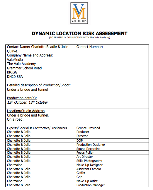


Here is our risk assessment for when we were filming on a road, under a bridge and in a tunnel.
Friday, 9 October 2015
Research: Costume/Mise en scene

Taylor Swift - Wildest Dream
One Direction - Drag me down
Lady Gaga - Judas
Nicki Minaj - Superbass
Sam Smith - Writings on the wall
Ellie Goulding - On my mind
All these examples of music videos shows various examples of individuality and relates to the song in terms of costume, make-up and location. Choosing the correct costume and set design I have found is a crucial part of making a music video; it allows the song to be explained more with the appearance of the characters and allows the emotions of the artist to be shown. For example in Lady Gaga's video for 'Judas', the overall colour theme is black with a small amount of colour; with the use of the bikes this also represents the type of character that she is trying to portray. Ellie Gouldings video for 'On my mind' has quite an opposite approach to that character that is trying to be portrayed. The use of light pale colours shows purity and could symbolise her being more vulnerable. In my own video I am going to think about what colours I could use that would show the personality in the star images, and choose locations that would work well with this.
Subscribe to:
Posts (Atom)