
Tuesday, 10 November 2015
Group post- Planning: Final shots
While editing we saw we needed just a few more shots of both Ethan and Charmaine together. As they both go to different colleges and it's quite difficult to organise a film shoot when they both have free periods, we created this simple written shot list so we knew exactly what we needed to finalise our video.


Monday, 9 November 2015


Further Research: Target Audience Research
Here is a voice recording of our feedback from a small focus group, after showing them the first minute of our music video. We wanted to know what they thought of using black and white for the music video, or whether it would look better with colour. As well as this we wanted to know their general thoughts and whether they had any ideas that we could use to improve.


Problems whilst filming
Whilst filming our video we found that when looking back at the footage, there numerous shots that were cut short. This was a problem that we were unsure about why it was happening, however it was something that we had to fix. With the shots being cut short this meant that the singing and acting was cut short as well, resulting in us being unable to use the footage. After rescheduling to re-shoot the footage, we continued to film for up an extra 15 seconds so there was no chance that the footage would be cut short.
In our music video we decided that we were going to use natural lighting throughout the whole of our music video, however this could often cause a problem with being able to focus on the actors with the sunlight being so bright. We fixed this by locating the camera in a better or convenient place and chose various angles to avoid the brightness.
There were some days where we had organised to film, but down to the whether we were unable to do this, resulting in having to rearrange. Filming in the rain would of made things very difficult, as well as it being a major distraction.
There were some days where we had organised to film, but down to the whether we were unable to do this, resulting in having to rearrange. Filming in the rain would of made things very difficult, as well as it being a major distraction.
Friday, 6 November 2015
Planning: Star Name
We have chosen to use 'Ethan B' for our star name for Ethan. We thought that this name is short, eye catching and suitable for our genre of song. Shortening 'Brown' to 'B' we thought would give the name a unique edge, and give something different to the star image. We have quite a few photos of Ethan that we are considering using for our digipak and magazine advert, and we feel as though these images along with some images of both Charmaine and Ethan together would work really well.

Further Research: Extreme close-up shots
Whilst watching this music video by Adele performing 'Hello', I found that there were a number of extreme close-up shots used throughout the song, which really allowed her emotions to be expressed. As I am currently filming for my own music video, I thought that using extreme close-ups would be something I should use, as the characters feelings is something that I want to be shown, with there being a story about a relationship. I think that in this music video the extreme close-up shows the importance of Adele in the video, it could be a way of allowing the emotions to be shown in a stronger and bolder way.

Here Adele is represented as powerful yet soft and feminine. She looks more mature and sophisticated and this is because she is reinventing herself after a break. According to Dyer, "A star is an image not a real person" and this is the case here. In this video she is enacting the role of a broken hearted lover and it signifies that she wants him back.
Monday, 2 November 2015
Sunday, 1 November 2015

Monday, 26 October 2015
Planning & Organisation: Shot lists


Sunday, 25 October 2015
Planning: Location ideas for music video
Locations for music video by Slidely Slideshow
The dominant colours in these location shots are: green, brown, gold, red brick, grey, red graffiti. The red writing may also provide a contrasting colour for our digipak and the advert.
The music video will represent a rural culture. There are many music videos that are set in urban locations and we felt a rural location would challenge conventions a little. Neale said genre is about "repetition and difference" so we want to use singing into camera, close ups of the artist, costumes that are Indie eg black and white, piercings, her hood, a burgundy jacket to establish and anchor the genre as Indie. However, our 'difference' will be in the locations and the colouration of the video.
Saturday, 24 October 2015

Planning: Star image
Who is our star image?
Ethan Brown, 17, Male
Role? Singer and plays the role of the boy who is madly in love with the girl who is playing hard to get.
Charmaine Abotchy, 17, Female
Role? The girl who is playing hard to get with Ethan but then eventually falls for him.
Why have we chosen Ethan?
We chose Ethan do be in our music video as he has previously stared in an A2 music video before; from experience he will have known what half to expect. He has quite a confident nature, so we didn't think he would have a problem singing into camera and acting in a 'loving' way towards another actor for the music video. As he previously was a drama student we also thought that this would be beneficial with him being able to perform well. As well as this, Ethan has the right sort of look for our music video, he wears dark clothing which is what we want in our music video.

Why have we chosen Charmaine?
We have chose Charmaine to be in our music video, as like Ethan was previously a drama student, so would be able to act as well as being able to follow instructions well. Charmaine hasn't performed in a music video before, however with being a drama student along side Ethan, (meaning they know each other well) and her confident persona, we thought that she would be reliable in our music video. Charmaine also has the perfect look that we want for our music video, again like Ethan she wears dark clothing and she also has numerous piercings which fits well with our genre.

Along with Charmaine's confidence, the costume choices give her a voyeuristic look; this will appeal to a male audience and fits with Laura Mulvey's theory about the 'male gaze'.
Ethan Brown, 17, Male
Role? Singer and plays the role of the boy who is madly in love with the girl who is playing hard to get.
Charmaine Abotchy, 17, Female
Role? The girl who is playing hard to get with Ethan but then eventually falls for him.
Why have we chosen Ethan?
We chose Ethan do be in our music video as he has previously stared in an A2 music video before; from experience he will have known what half to expect. He has quite a confident nature, so we didn't think he would have a problem singing into camera and acting in a 'loving' way towards another actor for the music video. As he previously was a drama student we also thought that this would be beneficial with him being able to perform well. As well as this, Ethan has the right sort of look for our music video, he wears dark clothing which is what we want in our music video.

We have chose Charmaine to be in our music video, as like Ethan was previously a drama student, so would be able to act as well as being able to follow instructions well. Charmaine hasn't performed in a music video before, however with being a drama student along side Ethan, (meaning they know each other well) and her confident persona, we thought that she would be reliable in our music video. Charmaine also has the perfect look that we want for our music video, again like Ethan she wears dark clothing and she also has numerous piercings which fits well with our genre.

Along with Charmaine's confidence, the costume choices give her a voyeuristic look; this will appeal to a male audience and fits with Laura Mulvey's theory about the 'male gaze'.
Friday, 23 October 2015
Research: Target Audience Research
Target audience research from joliequirke
From this questionnaire into target audience research I found that:
Black, white and grey are the most popular colours.
Ancillary tasks:
Green is very dominant in our music video. Green is symbolic [Barthes] of peace and nature. This might be a good complimentary colour to use.
From this questionnaire into target audience research I found that:
Black, white and grey are the most popular colours.
Ancillary tasks:
- Black font
- White backgrounds
- Black & white image would match the opacity used in the music video
- Possible use of grey banners/ border or lines
Green is very dominant in our music video. Green is symbolic [Barthes] of peace and nature. This might be a good complimentary colour to use.
Thursday, 15 October 2015
Wednesday, 14 October 2015
Tuesday, 13 October 2015

Saturday, 10 October 2015
Group post- Planning: Risk Assessment
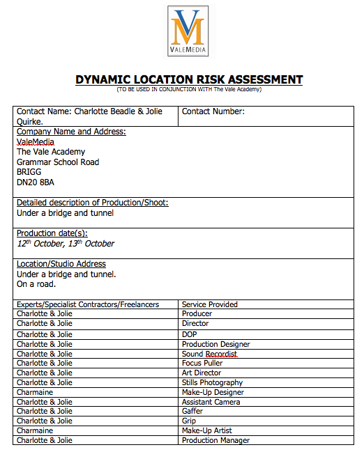


Here is our risk assessment for when we were filming on a road, under a bridge and in a tunnel.
Friday, 9 October 2015
Research: Costume/Mise en scene

Taylor Swift - Wildest Dream
One Direction - Drag me down
Lady Gaga - Judas
Nicki Minaj - Superbass
Sam Smith - Writings on the wall
Ellie Goulding - On my mind
All these examples of music videos shows various examples of individuality and relates to the song in terms of costume, make-up and location. Choosing the correct costume and set design I have found is a crucial part of making a music video; it allows the song to be explained more with the appearance of the characters and allows the emotions of the artist to be shown. For example in Lady Gaga's video for 'Judas', the overall colour theme is black with a small amount of colour; with the use of the bikes this also represents the type of character that she is trying to portray. Ellie Gouldings video for 'On my mind' has quite an opposite approach to that character that is trying to be portrayed. The use of light pale colours shows purity and could symbolise her being more vulnerable. In my own video I am going to think about what colours I could use that would show the personality in the star images, and choose locations that would work well with this.
Thursday, 8 October 2015
Research: Locations in music videos


Looking at location ideas from existing music videos, has shown me that locations can be shown and made to be effective in different ways, with the use of different shots.
For example the first shot shows a close up of the lead singer, but is being filmed in a studio. This could be something I would consider trying for my performance shots, as I think if done correctly it can work well with particular songs or genres.
The second shot is a long shot which has allowed the location to be fully shown to the audience, and gives detail to the surroundings of the singer.
I don't think that this is something that I would use in my own music video, as the story I want to use within my video, only posses particular characters.
The final shot is a medium shot of the lead singer walking away from camera. This allows the audience to see the singers surroundings just how he is. I like the idea of using this as I think it can be more effective than using a point of view shot.
Research: adverts in magazines for digipaks/new releases/tour and tour dates

Code & conventions
- Central text
- A range of font styles and sizes
- Institutional details
- Performance shot image
- looking into camera.
Yeezus : i like the bold font on this one. The phrase "New album" is a great idea and conventional. I like the use of the fonts but I think we should aim for something more subtle and bot quite as simple.
Rolling Stones: When the 1975 make an announcement he type writes it and posts it on twitter. This is where a great deal of my inspiration came from. It looks vintage and nostalgic.
Justin Bieber - I love the close up of this. I think this would suit Ethan as he has a good star image. The boxes and angles are interesting and this would work well with black and white.
Example of TV advertisement: unfortunately we won't be able to create a TV advert for our digipak however, it is part of a promotional package.
Research: Codes and conventions
What are codes and conventions?
These are ways of constructing meaning in media texts and are generally an excepted way of doing things. With this audiences can become familiar with particular genres and it can be made sure that certain texts works well and fits with the genre; it allows them to be easily recognised whilst making it easier for the audience to understand.
This can be separated into two categories: technical & symbolic.
Technical:


These are ways of constructing meaning in media texts and are generally an excepted way of doing things. With this audiences can become familiar with particular genres and it can be made sure that certain texts works well and fits with the genre; it allows them to be easily recognised whilst making it easier for the audience to understand.
This can be separated into two categories: technical & symbolic.
Technical:
- Camera shots/angles
- Editing
- Sound
- Equipment and technology used
Symbolic:
- Meanings that can be hidden behind what is obvious to see (e.g. facial expression, mise en scene)
An important convention used in a music video would be singing into camera. This can be used with any genre but could also portray a message with the singer telling a story and speaking directly to the audience.
Here are some examples of various artists singing into camera:


Friday, 2 October 2015
Research: Analysis of mise en scene, props and set design


This is a great angle and something we could target in our video.
 This shot is very voyeuristic. The costume is sexual and revealing. It is an interesting set design with the female and the dog in the frame. It is a studio shot; it represents a modern woman. She is a dominant female and as Perkins said " stereotypes are not simple" it signifies woman as strong. It seems impossible to stereotype women in a modern western society. We also want to use a modern strong woman however she does fall for him at the end signifying her vulnerability. Therefore we have both modern and traditional representations.


This is the end shot. It signifies their dominance and power - the girls against the world. Propps narrative theory is difficult to apply as the main narrative is women against women. there is no traditional villain.
Monday, 28 September 2015
Research: Locations for music video

These images I have collected I hope to find similar locations to use for my music video. With the colours used I think these locations suit my genre, and finding somewhere similar to these will look most effective in my video.

I've presented these few images found from music videos because I like the way the locations have been used. Again the colours used suit the genre I have chosen for my music video, and I like the idea of trying a shot in black and white.
Friday, 18 September 2015
Planning: First thoughts on what to include in our music video
- love story/affair - need to make it clear that he loves her more than she loves him
- boy tries to give girl gifts but she declines
- boy throwing gifts away in anger
- cutting in and out of performance - boy
- shots on her own = happy shots, laughter
- shots together = distant, cold
- longer ASL (slow song)
- jump cuts
- some black and white shots
- e-close up, high up shots, birds eye view, hand held
- natural shots
- over-cranking
- time lapse
- locations - market? under motorway bridge? places with nice scenery, Normanby park?
- end shot - boy finally gets the girl, just about to kiss then cuts
- final success - unique present?
Monday, 14 September 2015
Group post: Company name and logo
 The company name we have decided on is 'JC Records'. We have chosen thhis as even thought its not very creative, it is a short, simple name and a mixture of the first letter in our names. (Jolie and Charlotte) The logo will be 'JC' in bold letters and 'records' in smaller letters underneath. I produced this lgo on Adobe Elements 11. I think its simple but looks quite professional and smart.
Friday, 11 September 2015
Blueprint Film Visit
Today we had a visit from one of the producers from Blueprint film in Lincoln. We managed to gain a lot of knowledge about what its like to be a producer, which we will be able to put to use when filming our music video. This really helped us to understand how to organise our planning for our music video and gave us the opportunity for someone who has experience in film to give us some feedback of our ideas. Overall after the visit I felt I had gained a lot more knowledge in how to plan my filming and how to organise my shot lists, as well as feeling a lot more confident in the ideas that we had for are music video.


Monday, 7 September 2015
Research: Record label designs

I found this collection of record labels to gain some ideas of what we may want our label to look like, and if anything is similar between all of the label designs.
Subscribe to:
Posts (Atom)