Friday, 12 February 2016
FINAL- Digipak
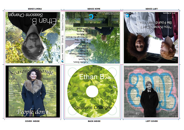
I have decided to edit in the green from the background of the Ethan shot. I feel like if we only had this panel of the digipak in black and white fully it would make it look boring at first glance. Now there are four parts of the digipak that include the bright green and I think this emphasises the synergy more and definitely makes it a lot more eye catching at first glance if someone was to see it on the shelf in a shop. As a result of not having too much text on the front I feel like the simple editing technique of including the green in the background makes it look a lot less boring and more unique. I changed the opacity I feel it looks more like what a real CD would look like. Having Charmaine smiling at one side and Ethan looking into the distance puts across how she is happy even when she is making Ethan's life hell, this is one way our ancillary products link with our music video narrative.
Subscribe to:
Post Comments (Atom)


No comments:
Post a Comment