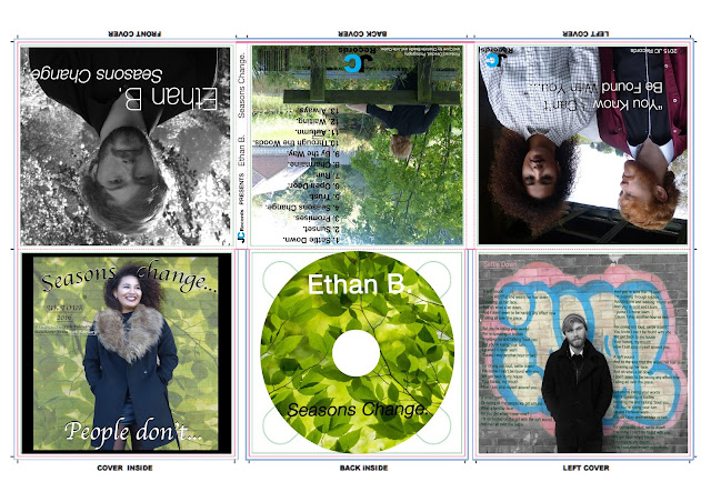
We have added a UK tour and European tour dates to our digipak as we feel advertising in the digipak will mean more people will see it and go see our singer live. My creativity skills have developed massively while putting this digipak together as we was going to leave this part of the digipak black with only 'Seasons change people don't.' on it. By using my creativity I put the green background in and this brightened it up a lot a it looked very dull and boring beforehand. I think by adding the green and the tour dates makes it look more eye catching and appealing to our target audience who probably wouldn't be attracted to this digipak if it was boring and dull.
Sunday, 10 January 2016
Monday, 4 January 2016
Group post- Digipak: Draft 7

This is out digipak draft 7. The major change we had made from the previous draft to this one is the inside cover. We text wrapped the 'seasons change' around her head as it looked stupid covering her forehead. I also duplicated the text layers and moved the bottom layer to give a 3D effect. The background looked dull with just the wall there, so I decided to create more synergy and edit in the leaves from the CD and also the leaves featured on the magazine advert. I feel like making these small changes made a big difference as it makes it look more appealing and eye catching. We are adding UK tour dates on the left Europe tour dates on the right. We are adding more text to make it look less boring and to add more information to the debut album.
Subscribe to:
Comments (Atom)


